< Back to All
Conci
Originally pitched to my design team as a safe sex and dating app, initial research informed us that the app's vision was something the users neither wanted or needed. It was clear that we needed a new angle. In an interview with the primary stakeholder, she explained that she thought of the idea of a safe sex mobile app while she was traveling abroad. This gave our team a new angle for a product: a tool for solo travelers to stay safe.

Process
Research & Discovery
Surveys and interviews were conducted with participants found through dating apps such as Tinder, Hinge, and Bumble. In addition, we conducted research on the work that would be necessary for the proposed features: STD test result proof, background checks, and consent contracts. Through this research, our team discovered a few legality issues regarding showing health data and the validity of consent contracts. Many of our survey participants and interviewees also reported that these features would make them more uncomfortable than not having them at all.
The results of user research in combination with our stakeholder interview gave way to a whole new round of surveys and interviews with a new focus: solo travelers.
Features
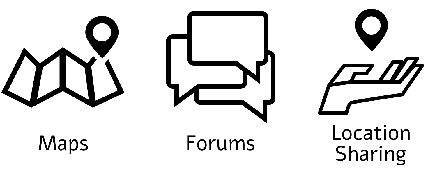
Using the information gathered from our second round of interviews, we conducted an affinity mapping workshop in order to identify key features for an app that serves solo travelers. We came up with nine.
With the goal of creating an MVP, 9 features was obviously way too many. We asked our interview participants to list out the potential features in order of most important to least important and came up with six core features.

Structure and Design
This project had a tight 3-week deadline, and our team wanted to deliver as much as we could to get an MVP to our client. We created a map that showed all potential pages/screens that included the core features, wireframed user flows for three of those six features, a new app name (Conci, short for "concierge,") a style and branding guide, an app logo, and some high-fidelity mockups to illustrate the application of the style and branding within the app.

What's Next for Conci?
User Testing
With the short timeframe of this project, there wasn't enough time to test our prototype with users and create new iterations. Testing would further validate our features and ensure an intuitive experience.
Wireframing and Prototyping All Features
In our research we discovered the need for 6 key features, but with our tight 3-week timeline, we didn’t have time to build out each of those flows. In the next design phase, the health resources and travel buddy features would be able to be built out completely.
< Back to All